Avatar
Avatar component is used to represent a user or product brand, it can display text, icons, or images.
Shape
Avatar
shape can be a circle, rounded or square.Size
Avatar component comes in 3 sizes
sm, md and lg, it also allow to to set custom size.Type
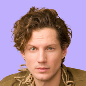
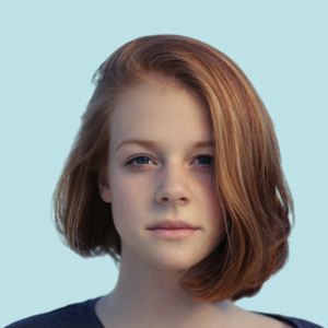
Avatar can display in text, icons, or images
AT
Color
Colors can be apply to text & icons avatar via props
backgroundColor & textColorA
Status
Avatar can also have status badge along with
Badge component.99
Avatar Group
Chain multiple Avatar in a row
 +2
+2API
Avatar
| Prop | Description | Type | Default |
|---|---|---|---|
| shape | Shape of Avatar | 'rounded-sm' | 'square' | 'circle' | 'rounded-sm' |
| size | Size of Avatar | 'lg' | 'md' | 'sm' | number | 'md' |
| icon | Avatar Icon | ReactNode | - |
| src | Image url of Avatar image | string | - |
| srcSet | srcset attribute for Avatar image | string | - |
| alt | alt attribute for Avatar image | string | - |
Avatar.Group
| Prop | Description | Type | Default |
|---|---|---|---|
| chained | Whether to stack avatars within group | boolean | false |
| maxCount | Limited avatars to display & append an ommited avatar | number | 4 |
| omittedAvatarContent | Custom omitted avatar content | string | ReactNode | |
| omittedAvatarProps | Omitted avatar props | Object (Refer to Avatar props above) | - |
| omittedAvatarTooltip | Whether to enable tooltip for omitted avatar | boolean | false |
| onOmittedAvatarClick | Callback when omitted avatar clicked | () => void | - |
| omittedAvatarTooltipProps | Props for omitted avatar tooltip, refer to tooltip props for details | Object | - |